http://thegreatrecession.info/blog/
The best time to size up the collapse in housing that I called almost two years ago will be when it is over — so we can visualize its full extent. Since it is now over by some measures, though not by others, this might be as good as we get for awhile as a moment when we can pause to take a broad scan of the full extent of our damages to date. However, as you’ll see below, we’re still clinging to the side of a cliff. We’re not back up on top.
The purpose of this article is to give a little more perspective to my last article on the housing collapse with some updated information and graphs. Alhambra Partners has created some graphs that give a clear picture of our slide to date. As I said back in 2018, I did not think this collapse would be nearly as great as the housing crisis that caused the Great Recession, nor did I think it would be the cause of the next recession, but would just be a part of it.
A canyon formed in housing sales
First, let’s look, as a reminder, at sales (number of units sold), which I covered somewhat in my last article on housing:
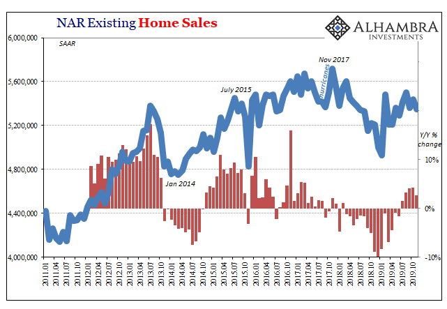
The steep-sided canyon is evident, and you can see that sales, according to the National Association of Realtors, are still well below the summit they attained before I called the housing decline in the summer of 2018. In fact, the sales rate (red bars) even appears to be slacking off a little again.
The full depth of the drop in sales is greater than the decline that came in 2014 as a second dip on the tail of the Great Recession. The decline is also longer in duration, and it is still continuing, since sales have nowhere nearly recovered to their previous peak.
The drop in new-home sales started sooner than existing-home sales, and perhaps that is why new-home sales have now fully recovered:

A ravine formed in housing prices
Second, let’s see what effect the collapse in sales had on housing prices, which were not covered in my last article. The effect is most evident in new-home prices. The following chart shows the growth (or decline) rate year-on-year in new-home prices, which are still declining (i.e., below the 0% growth line), albeit barely:
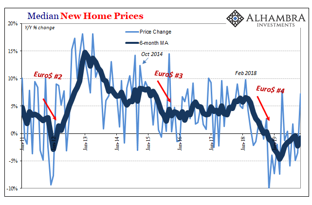
While sales (number of houses sold) have recovered, prices on the six-month moving average are still slightly falling, and they will have to get back to rising and then rise for quite awhile before prices recover to the point from which they fell. (Bear in mind, the graph shows the rate at which prices are rising or falling, not the price level.) So, actual prices haven’t started recovering at all yet. That means, even if sales hold as they are, prices are still months away from getting back to their peak level, as they are still slowly descending.
Here’s another graph that shows both the median house price (top graph) and the amount by which prices rose or fell each month (year on year):
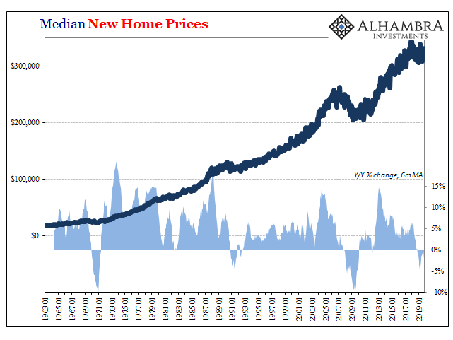
You can see in the bottom part of the graph that the decline rate got to about a third the rate we saw in the great housing bust and has, so far, only gone on for about half as long. Price change is now just about back to neutral but not rising. The decline in overall prices (top part of the graph) is more significant than anything seen since the Great Recession, and is greater than any other time going back to 1963, but it is only about a third of what we saw during the housing collapse of the Great Recession.
So, it has turned out as I anticipated (though it is not completely over in all respects) in that it is not as great as the Great Recession and did not, in and of itself, cause a recession; but it is greater than any decline going back, at least, as far as 1963. (If the graph were logarithmic, showing essentially the percentage by which median prices rose and fell, versus total dollar amounts — the decline in the early seventies would probably look somewhat deeper then the current housing decline. I could not find a current logarithmic graph of home prices.)
The charts above are the national median, and the collapse did not, of course, hit all parts of the country. So, people in many parts of the country will have felt nothing. Even the collapse of 2007-2010 took a lot longer to hit some parts of the country than others, and did not take those parts down in price nearly as far. This one isn’t quite over in that sales of new homes have recovered to their peak, but prices are not even starting back up. They are just falling slower now than a year ago.
Still sliding down a slippery slope
Just as news came through in December that “Existing-home sales soar to best pace in nearly 2 years,” pending sales in December (which would be those that will be coming through as actual sales in January and February), saw their largest month-on-month plunge in years (note the red bar below):
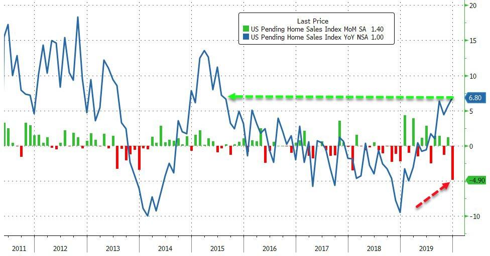
After a surge in existing home sales [in December] and a 3rd monthly decline in new home sales, pending home sales for December were expected to break the tie over the state of US housing with a continued rebound. However, they very much did not … crashing 4.9% MoM, the biggest monthly drop since May 2010. All regional indices were down in December.
Zero Hedge
We have yet to see how this drop in pending sales pans out in actual sales for January and February. Presuably, it will mean things have headed back down.
Throughout the collapse in sales, the main thing keeping prices from falling more was that inventory of homes on the market remained very low in keeping with the lowered demand. That tends to stabilize prices, even though the number of sales are falling because supply is synching up to demand all the way down. For home builders (new home sales), that means falling revenue, even if prices remain stable. For home owners (existing home sales) that means they are choosing to sit in their homes longer and not enter a falling market.
Pending home sales in December fell 4.9% from the prior month, the largest decline in almost a decade, according to a report Wednesday from the National Association of Realtors. The seasonally adjusted index measuring signed contracts fell because of a shortage of homes on the market, according to Lawerence Yun, NAR’s chief economist.
HousingWire
Where we’re going from here
In short, it’s too early to tell if we’re out of the woods yet, but we can step back for a moment and get a clear picture of how far we’ve fallen so far. What we see is a chasm unequaled in depth and width since the much larger Great Recession and maybe since any time other than the Great Recession, going back, at least, as far as 1963.
We’ll have to see how the drop in December’s pending sales translates into actual closed sales in January and February to know if things are heading back down and will have to see prices reattain their last peak, on the other hand, to know this is all over. For now, we’ve landed on a sloped ledge, but our feet are still sliding downslope as we cling to the roots of hope.
My own prediction for 2020 was that housing will likely stabilize some for the time being, but that’s mostly because I felt I needed to be optimistic about something. Actually, it’s because mortgage rates have settled back to their all-time lows now that the Fed is pumping money again.
As long as the Fed’s money pumping continues, there are, at least, some signs of interim hope for housing because the Fed’s money pumping keeps US bond yields down. That over time presses down mortgage interest rates that are largely based on bond yields. Bubble action works like this: so long as the Fed keeps blowing hot air, the bubble inflates; start sucking air out, and it deflates. Simple as that. It was the Fed’s scheduled tightening regime in 2018 that was, by my logic, certain to bring this latest housing bubble down in time, just as its tightening in 2007 did. Those are the times when the Fed inhaled.
The current reversal in the monetary regime by the Fed should reverse the housing collapse for as long as the Fed can maintain its present charade. It is a charade in that the Fed claims it is not breaking the law when it makes US debt purchases permanent. (It is pretending they are temporary by doing them as repos, which are very short-term; but then it is endlessly rolling them over, making them truly indefinite in length.)
Thus, we’re seeing some reprieve in the housing collapse; but the Fed’s whole plan is ultimately going to prove devastating because the unintended distortions in the economy that are the outcome of the Fed’s easing are becoming harder to manage, as evidenced by the Repo Crisis that remains unresolved and that even picked back up in the last couple of weeks.
Hyman Minsky argued there is an inherent instability in financial markets. He postulated that an abnormally long bullish economic growth cycle would spur an asymmetric rise in market speculation which would eventually result in market instability and collapse. A “Minsky Moment” crisis follows a prolonged period of bullish speculation which is also associated with high amounts of debt taken on by both retail and institutional investors.
Real Investment Advice
The longer the Fed continues creating distortions by fueling rampant speculation in multiple markets — bonds, leveraged loans, repo loans, stocks, real estate, etc. — the more potential Minsky Moments keep building insidiously in all of those speculation-driven, arbitrage-traded markets. Eventually, a crash of any of those markets doesn’t even require that the Fed pull out its support. One or another or all will fail simply because of internal instability.
Yet despite the clearest signs that global credit has been grossly misallocated and that global credit risk has been seriously mispriced, both markets and policymakers seem to be remarkably sanguine. It would seem that the furthest thing from their minds is that once again we could experience a Minsky moment involving a violent repricing of risky assets that could cause real strains in the financial markets.
With so much complacency toward the misallocation of credit, it’s hard to see how anything could go wrong at this point. Apparently, it is for most, anyway.